Tips and Tricks for Creating Stunning Designs with Canva
Canva has become a go-to tool for content creators and anyone eager to try their hand at design. But what are the tips and tricks for creating truly impressive work with Canva? Whether you’re putting together social media posts, presentations, or blog visuals, Canva’s templates, graphics, and tools make it much easier than you might expect to create polished, professional-looking designs.
Even if you have no design experience at all, don’t let that hold you back. Canva’s interface is so intuitive that you’ll feel comfortable with it after just a few hours of use. Let’s take a look at a few tips that will help take your Canva skills to the next level.
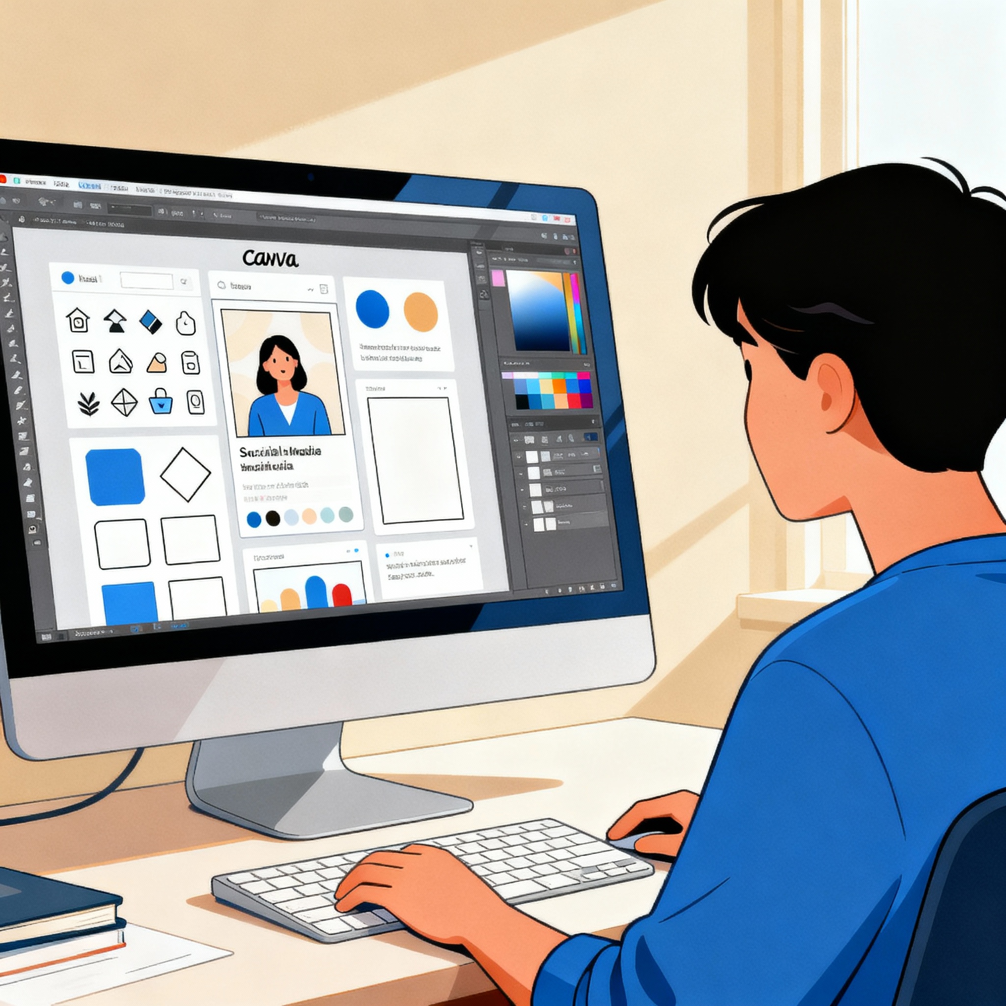
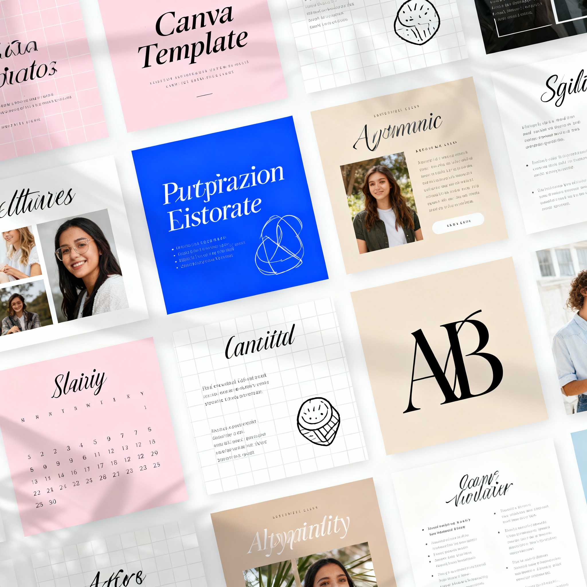
One of Canva’s biggest strengths is its extensive template library. But using templates exactly as they come won’t set your work apart. Think of a template as a starting point; you can make it your own by changing the colors, fonts, visuals, and layout.
Adding your brand colors and logo to your designs builds strong brand awareness over time. For example, if you run a coffee shop, sticking to earthy tones and a simple font family helps create a cohesive identity across all your visuals. Canva’s font pairing suggestions are also especially helpful here, so they’re definitely worth trying.
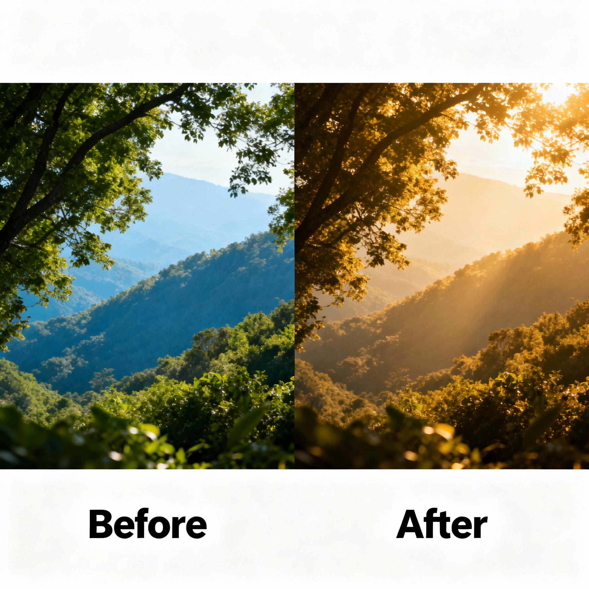
Visuals are the backbone of great design. You can use Canva’s built-in library, but uploading your own photos adds a much more authentic touch to your work. Choosing high-resolution images is essential; a blurry or pixelated image can ruin the result, no matter how strong the overall composition is.
After selecting an image, you can use Canva’s editing tools to apply filters, adjust brightness and contrast, and add text or graphic elements on top. If you’re creating a nature-themed design, a background photo in green tones will work much better, while an architectural shot is ideal for city-themed content. For even more creative visuals, you can also check out our Creating Images with AI: A Step-by-Step Guide content.
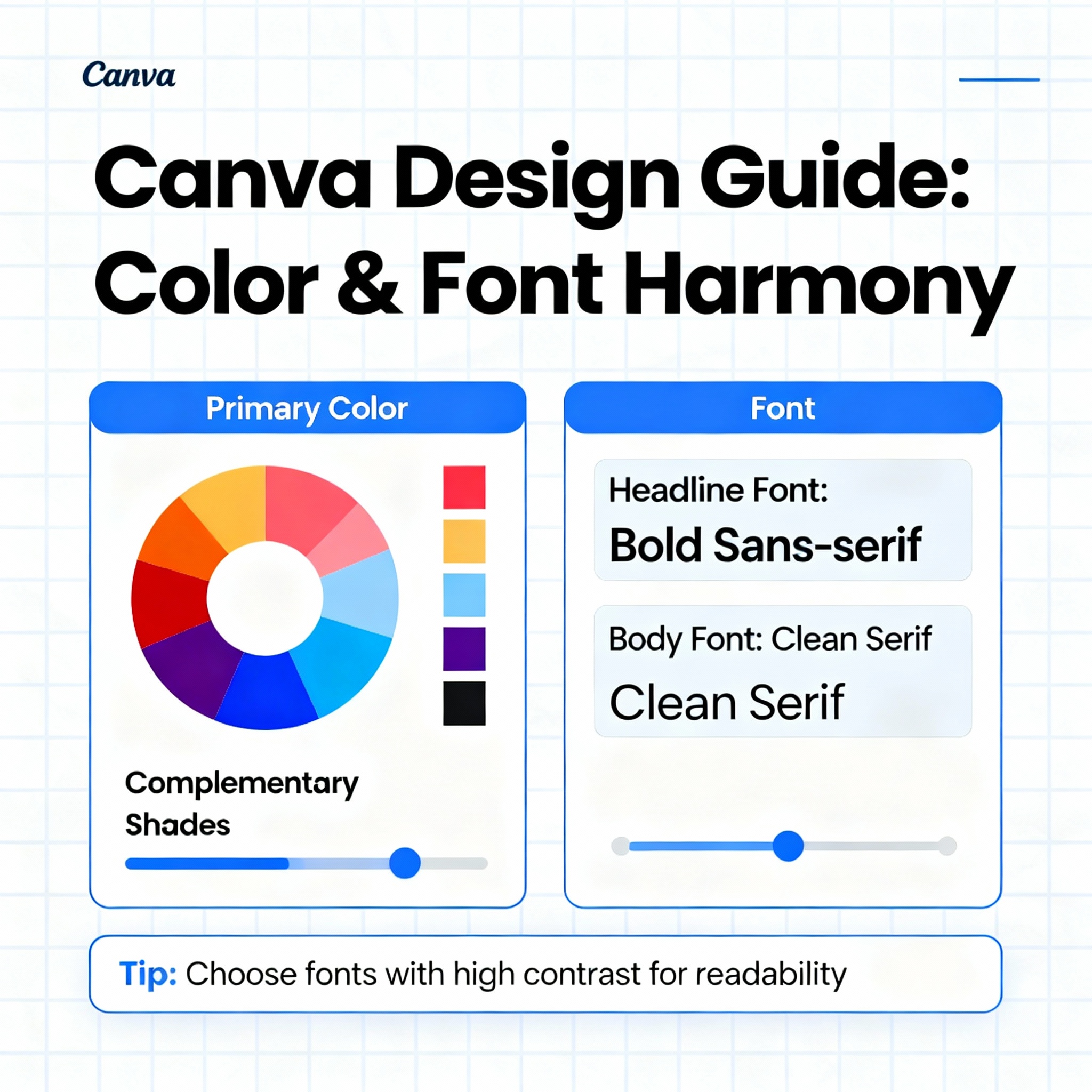
Colors and Fonts
Colors and fonts define the personality of a design. The wrong color combination can distract viewers, no matter how strong your content is. Canva’s color palette tools make it easy to find harmonious combinations, and you can create a custom palette for your brand in just a few clicks.
There are two basic rules to keep in mind when choosing fonts: headlines should stand out, and body text should stay easy to read. The safest approach is to use a bold, distinctive font for the headline and a simple, rounded font for the paragraphs. If you reverse that balance, the page can quickly feel chaotic.
Colors and fonts also serve an emotional purpose, not just an aesthetic one. Red creates a sense of urgency, blue conveys trust, and yellow feels energetic. If you know which emotion you want to evoke from the start, your choices will be much more effective. And if you want to take the quality of your visuals even further, the article Enhancing Photo Quality: The Power of AI may also be useful.